
Time Series Analysis Basics - Autocorrelation
One of the first things I do when I wake up is checking the weather network. If it says it’ll be -10 degrees, I’d wear my winter coat, and if it’s above 10 degrees, I’d probably go for a light jacket. Now imagine a scenario that the app is consistently incorrect in the winter time by +10 degrees (maybe due to global warming or calculation failure). For the 5th time of the week, you wore your hefty winter coat, only to find out it’s really warm outside and now you’re sweating like a pig. You start to wonder, “why don’t they just lower their prediction by 10 degrees?” This is precisely what autocorrelation is.

Figure 1: amirite
Autocorrelation (or Serial correlation)
Continuing from my last post, we’re going to look at a characteristic of time series that needs to be understood before carrying out analysis. A correlation occurs when two independent variables are related to each other. On the other hand. Autocorrelation occurs when a variable is related to the lagged version of itself. Autocorrelation can take a value between -1 and 1, with 1 being completely positively correlated, 0 being not correlated at all, and -1 being completely negatively correlated. This is easy to understand in a time series. If the temparature today is related to the temparatures of the past week, season, or year, then we say that there is an autocorrelation in the temparature.
The problem with data that has autocorrelation comes when you’re building a model to predict the future value. This excellent article which I stole the below picture from, goes over this in details.
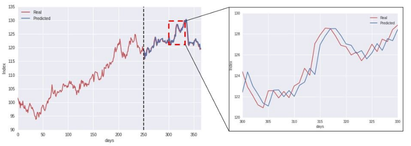
Figure 2: Problem with autocorrelation
The blue line represents the outcome from a blindly-used machine learning program. It looks really accurate right? Not really. If you look carefully, what it’s doing is simply using the actual value of yesterday, to “predict” the value of today. This is problematic because it gives the modeller an illusion that their algorithm is actually doing a good job, when it’s not. In fact, the data for red line was generated using a random walk process, which is impossible to predict in its nature.
How to detect autocorrelation?
Now that we understand that it can be dangerous to ignore autocorrelation, let’s look at how to identify it.
Autocorrelation Function (ACF)
ACF tells you the correlation between points separated by various lags. For example, ACF(0) is the correlation that a data point has with itself (obviously 1), and ACF(10) is the correlation that a data point has with the value 10 days ago, or whatever interval you’re using. We’ll illustrate this using some built-in datasets in R.
LakeHuron library records the annual level of Lake Huron.
plot(LakeHuron, main = "Level of Lake Huron")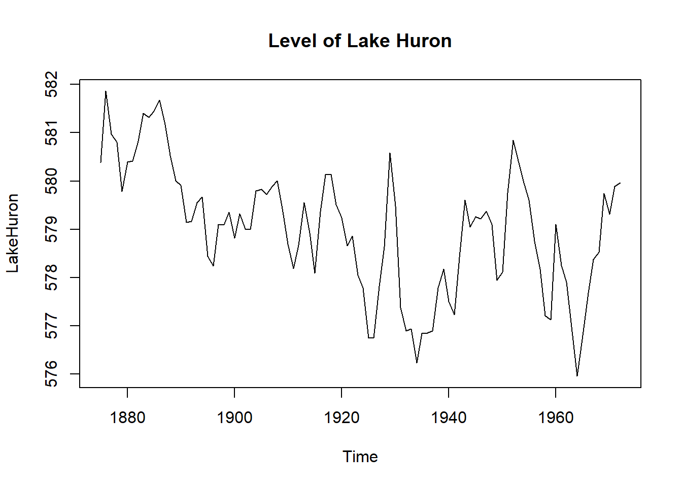
The plot looks random enough, but let’s look at the autocorrelation to see what’s really going on.
acf(LakeHuron, main = "ACF of level of Lake Huron")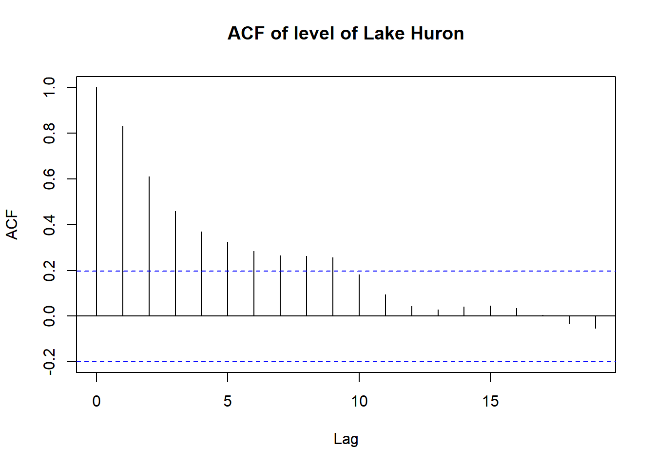
This correlogram tells us that LakeHuron level has strong positive correlation that slowly decays. At lag 0, ACF is 1. This is obvious, as a data point is perfectly related to itself. But as we increase the lags, we see ACF get smaller and smaller. (as you space out the points, they become less correlated with each other) In other words, the level of lake Huron is likely to be similar next year, rather than 20 years later. Another cool feature of this graph is that any values outside the blue dashed lines tell us that those values are significantly different from 0 (we’re fairly sure the autocorrelation is present)
Differencing
If you remember from my last post, you would have noticed that the line plot of Lake Huron is NOT stationary. One easy way to deal with this, is differencing the data. I’m simply gonna find the first order difference between two consecutive values (level in 1881 - level in 1880).
## lag = 1 and differences = 1 are default values that I can skip

plot(diff(LakeHuron, lag = 1, differences = 1))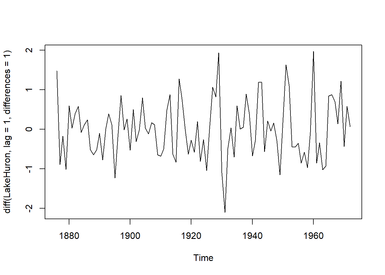
Ehh, certainly looks better, with mean being almost constant, but the variance is still out of wack. Let’s look at the correlogram.
acf(diff(LakeHuron), main = "ACF of differenced level of Lake Huron")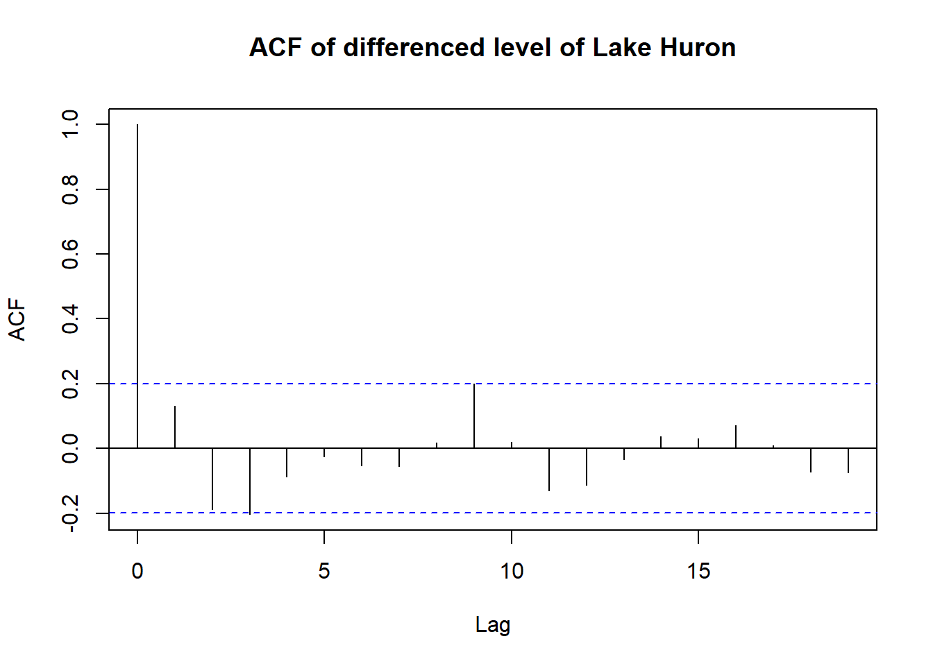
That’s a significant improvement over the initial correlogram in dealing with autocorrelation. Notice how all points but lag = 0, fall within the blue line. This means that at all lags greater than 0 are fairly certain to have no autocorrelation.
How to detect autocorrelation? - Seasonality
The last thing I wanted to cover today is seasonality. I think everyone knows what seasonality means. It’s when data experiences regular and predictable changes that recur every once in a while. Using another built-in dataset, seasonality looks like this on a graph.
plot(UKgas, main = "UK quarterly gas consumption")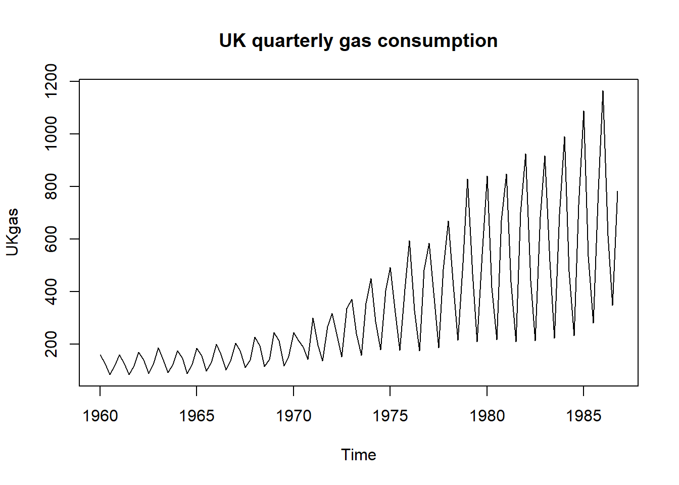
Similar patterns are repeated over and over. It’s most likely because people tend to use more gas to heat up their homes during winter, and less in summer. This is not going to change unless global warming dooms us. Let’s repeat the same process as above, how does the correlogram look like?
acf(UKgas, main = "ACF of UK quarterly gas consumption")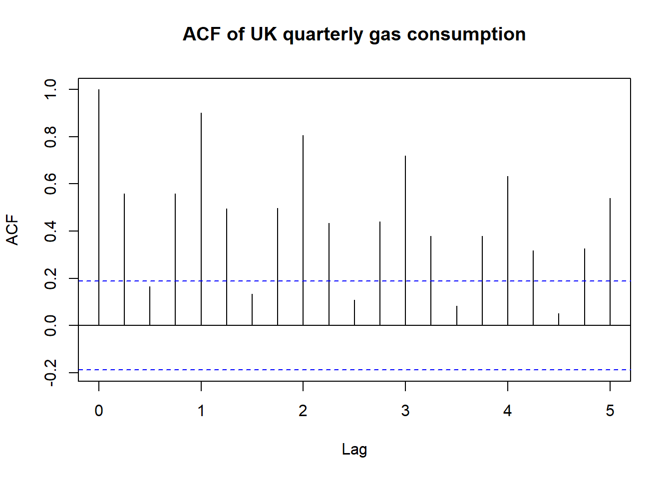
See how there’s a pattern that’s repeated? The lines that stick out represent lags of an entire year. If you compare winter 1986 to winter 1985, they are obviously going to be similar, but if you compare winter 1986, to summer 1986, it’s not going to be correlated at all. (the low lines of lags 0.5, 1.5, 2.5, …)
Now let’s see if differencing does anything for us. We know that similar patterns are observed every 4 periods.
plot(diff(UKgas, lag = 4),
     main = "Line plot of differenced UK quarterly gas consumption")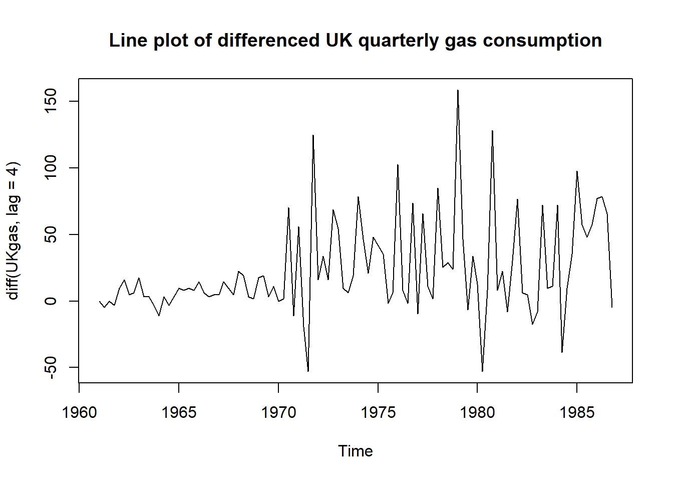
Same story I think. The mean is somewhat constant, but the variance is still wild. Let’s look at the correlogram.
acf(diff(UKgas, lag = 4), main = "ACF of differenced UK quarterly gas consumption")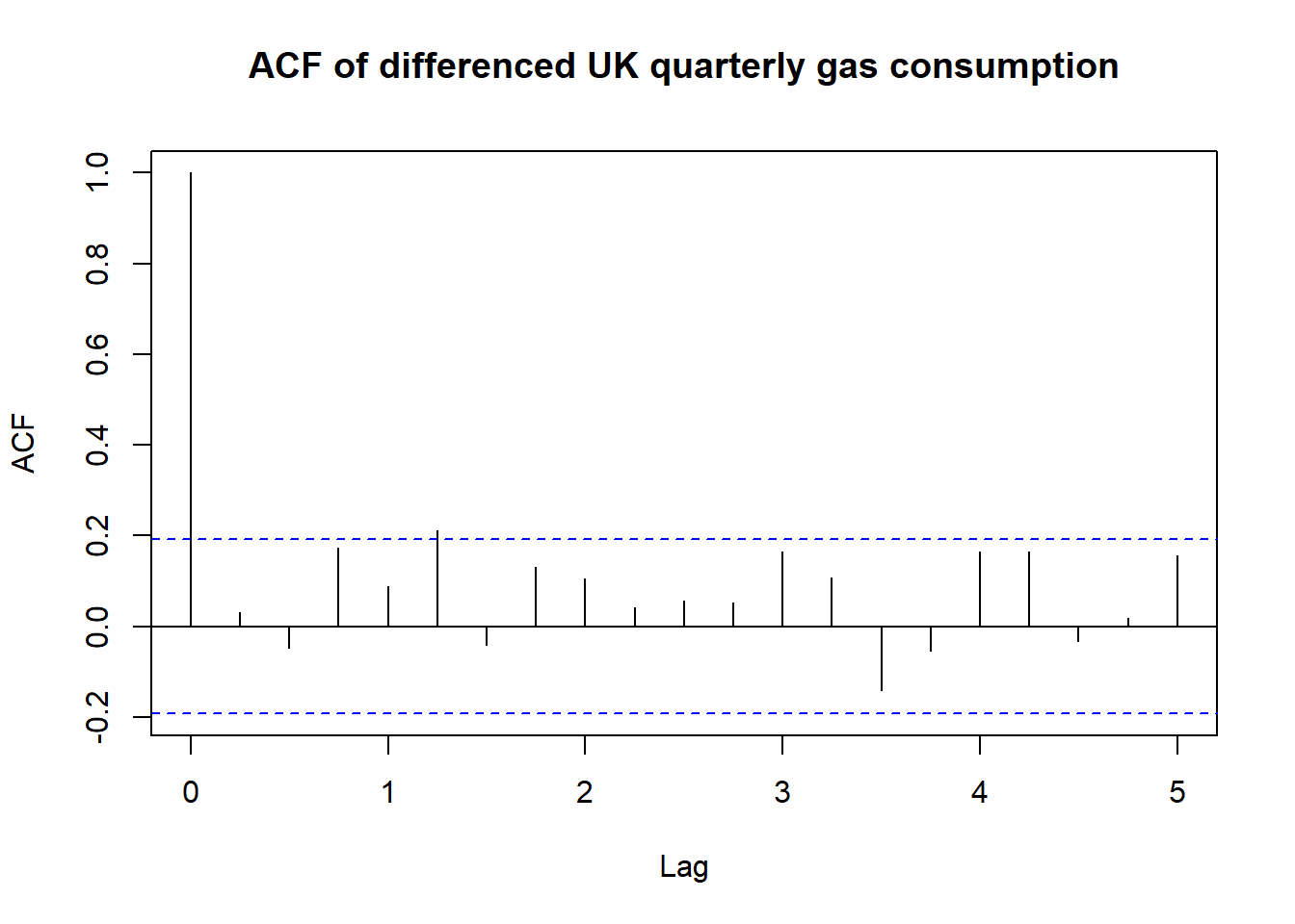
What we’ve done here is taking the differences between Q1 1961 & Q1 1960, Q2 1961 & Q2 1960, and so on. And we used those values to see if they correlate to each other. As you can see, most autocorrelations fall under the blue lines and the graph looks much better.
Conclusion
We’ve seen what autocorrelation is, how to detect and somewhat remedy it. I still haven’t covered Partial Autocorrelation Function, which is a sister function of the ACF we saw, but that’ll have to wait till next time. When am I ever going to get to ARIMA 😭