
Improving Usability of Budget Excel Sheets
Hey, this short post is going to go over how to better format your excel sheets for data analytics purposes. If you’ve ever worked with Excel in your professional/personal life, you’ve most likely ran into a budget sheet that looks like this.
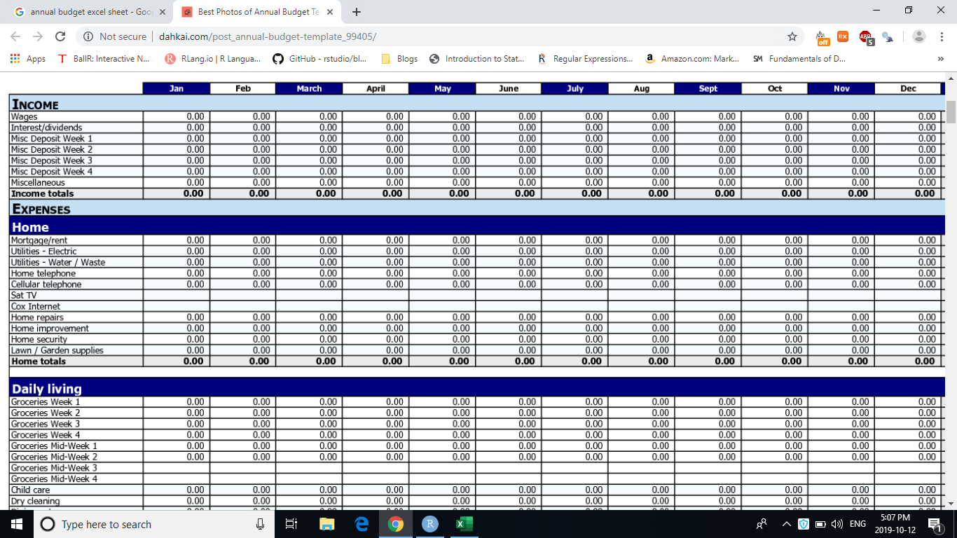
Figure 1: Shoutout to dahkai.com, you insecure website
There’s nothing too wrong about sheets like this when the file is relatively small, and you’re just working within Excel. But even then, there are probably a bunch of consolidated cells, and hidden rows/columns that makes it hard for you to keep track of the formulas. Oh, and God forbid if someone else made that sheet, and you have to figure out how they constructed it. I personally find this really frustrating about Excel, and often choose to not use it at all. Today, I’m just gonna share with y’all quickly how I like to format my data.
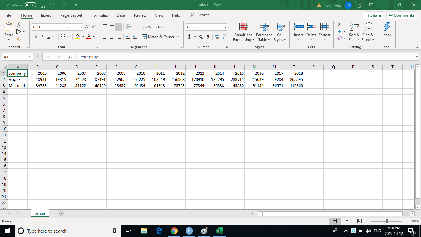
Figure 2: Annual revenues have their own individual columns
Above is the annual revenues of Apple and Microsoft between 2005 and 2018. You’ll notice that the progression of time is represented horizontally. If I import this into R, I get a data.frame like this:
library(tidyverse)

company_revenues <- read_csv("prices.csv")
company_revenues
## # A tibble: 2 x 15
## company `2005` `2006` `2007` `2008` `2009` `2010` `2011` `2012` `2013` `2014`
## <chr> <dbl> <dbl> <dbl> <dbl> <dbl> <dbl> <dbl> <dbl> <dbl> <dbl>
## 1 Apple 13931 19315 24578 37491 42905 65225 108249 156508 170910 182795
## 2 Micros~ 39788 44282 51122 60420 58437 62484 69943 73723 77849 86833
## # ... with 4 more variables: `2015` <dbl>, `2016` <dbl>, `2017` <dbl>,
## # `2018` <dbl>This format is a little difficult to work with, because the unspoken agreement of most programming languages is that rows represent each instance of an object, and columns represent the characteristics about the objects. But what we have here is one characteristics (revenue) spanned over 14 columns.
To remedy this, let’s put the years in one column, and another column that represents the revenue for that year. In other words, I’m going to transpose the data. Firstly, I’m going to gather the data, which grabs the names of each column as key and what’s inside that column as value. I chose to use the words key and value, but you can use any other words that make the most sense to you.
company_revenues %>%
  gather(key, value)
## # A tibble: 30 x 2
## key value
## <chr> <chr>
## 1 company Apple
## 2 company Microsoft
## 3 2005 13931
## 4 2005 39788
## 5 2006 19315
## 6 2006 44282
## 7 2007 24578
## 8 2007 51122
## 9 2008 37491
## 10 2008 60420
## # ... with 20 more rowsYou get the idea, there were two elements in a single column, and they are basically organized into the format of column name, and corresponding column value. A neat trick: if you exclude a column from gather, the data will collect around them. What do I mean by this? Let’s exclude company.
company_revenues %>%
  gather(key, value, -company)
## # A tibble: 28 x 3
## company key value
## <chr> <chr> <dbl>
## 1 Apple 2005 13931
## 2 Microsoft 2005 39788
## 3 Apple 2006 19315
## 4 Microsoft 2006 44282
## 5 Apple 2007 24578
## 6 Microsoft 2007 51122
## 7 Apple 2008 37491
## 8 Microsoft 2008 60420
## 9 Apple 2009 42905
## 10 Microsoft 2009 58437
## # ... with 18 more rowsNow, you’ll see that there are year column and revenue column for both companies! This is great, because you can easily filter between the two companies to make some graphs. (I did so with facet_wrap(~ company))
# A simplistic built-in theme
theme_set(theme_light())

company_revenues %>%
  gather(key, value, -company) %>%
  ggplot(aes(key, value)) +
  geom_col() +
  scale_y_continuous(labels = scales::comma_format()) +
  facet_wrap(~ company) +
  labs(title = "Annual revenues of Apple and Microsoft",
       x = "Time",
       y = "Revenue in millions")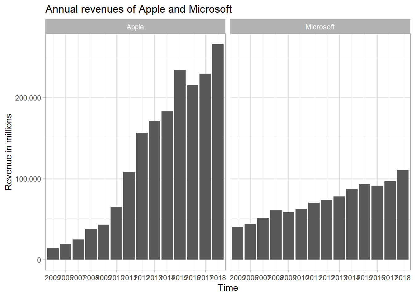
If you’d like, you can actually give each company a column of their own. In other words, we can spread the revenues by company.
company_revenues %>%
  gather(key, value, -company) %>%
  spread(company, value)
## # A tibble: 14 x 3
## key Apple Microsoft
## <chr> <dbl> <dbl>
## 1 2005 13931 39788
## 2 2006 19315 44282
## 3 2007 24578 51122
## 4 2008 37491 60420
## 5 2009 42905 58437
## 6 2010 65225 62484
## 7 2011 108249 69943
## 8 2012 156508 73723
## 9 2013 170910 77849
## 10 2014 182795 86833
## 11 2015 233715 93580
## 12 2016 215639 91154
## 13 2017 229234 96571
## 14 2018 265595 110360So now, we have 14 rows for 14 instances of revenues of both companies. This is much easier to work with to make a graph for one company.
company_revenues %>%
  gather(key, value, -company) %>%
  spread(company, value) %>%
  ggplot(aes(key, Apple)) +
  geom_col() +
  scale_y_continuous(labels = scales::comma_format()) +
  labs(title = "Apple revenue over the years",
       x = "Time",
       y = "Revenue in millions")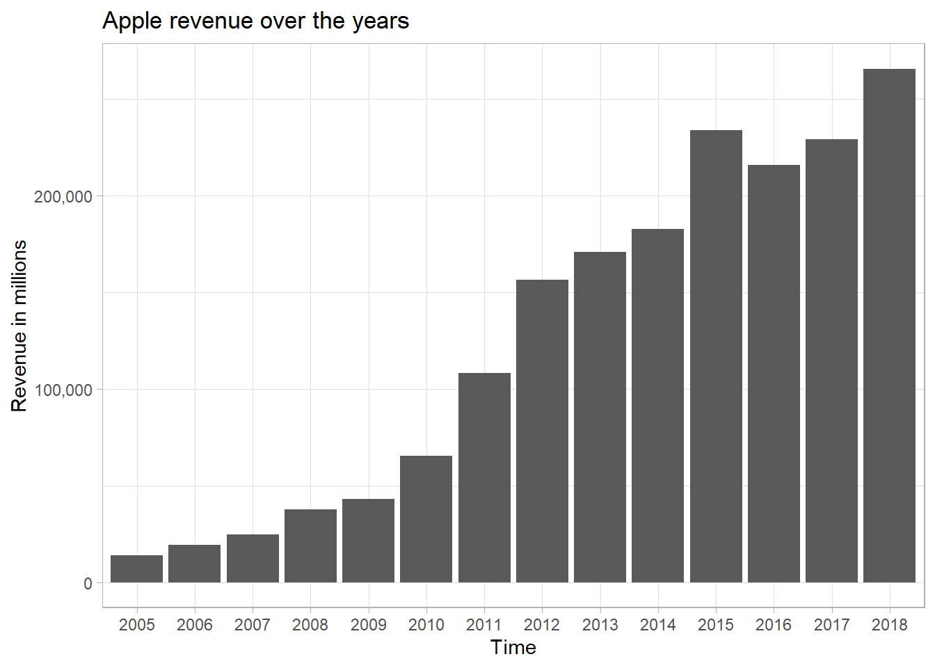
Hope you got something out of this. See you next time :)