How to rotate lines in ggplot to make art
Hey what’s up everybody! Writing here after seeing someone on Twitter saying that it’s a really good habit to make a quick blog post on new things you learn lol. That really stuck with me, but I can’t remember who it was! 😭 But one thing that I do remember seeing today is Tim Holman’s tweet.
A wonderful NEW tutorial by @brunoimbrizi on generative artistry! https://t.co/o0oTnhsZJi ... these are the best open source moments! pic.twitter.com/vGlXkysC02
— Tim Holman (@twholman) May 14, 2021
They did an amazing job recreating an art print called Hours of Dark 2011 by Accept & Proceed. This was in JS (…i think?), so I decided to take what I learned there and apply in R.
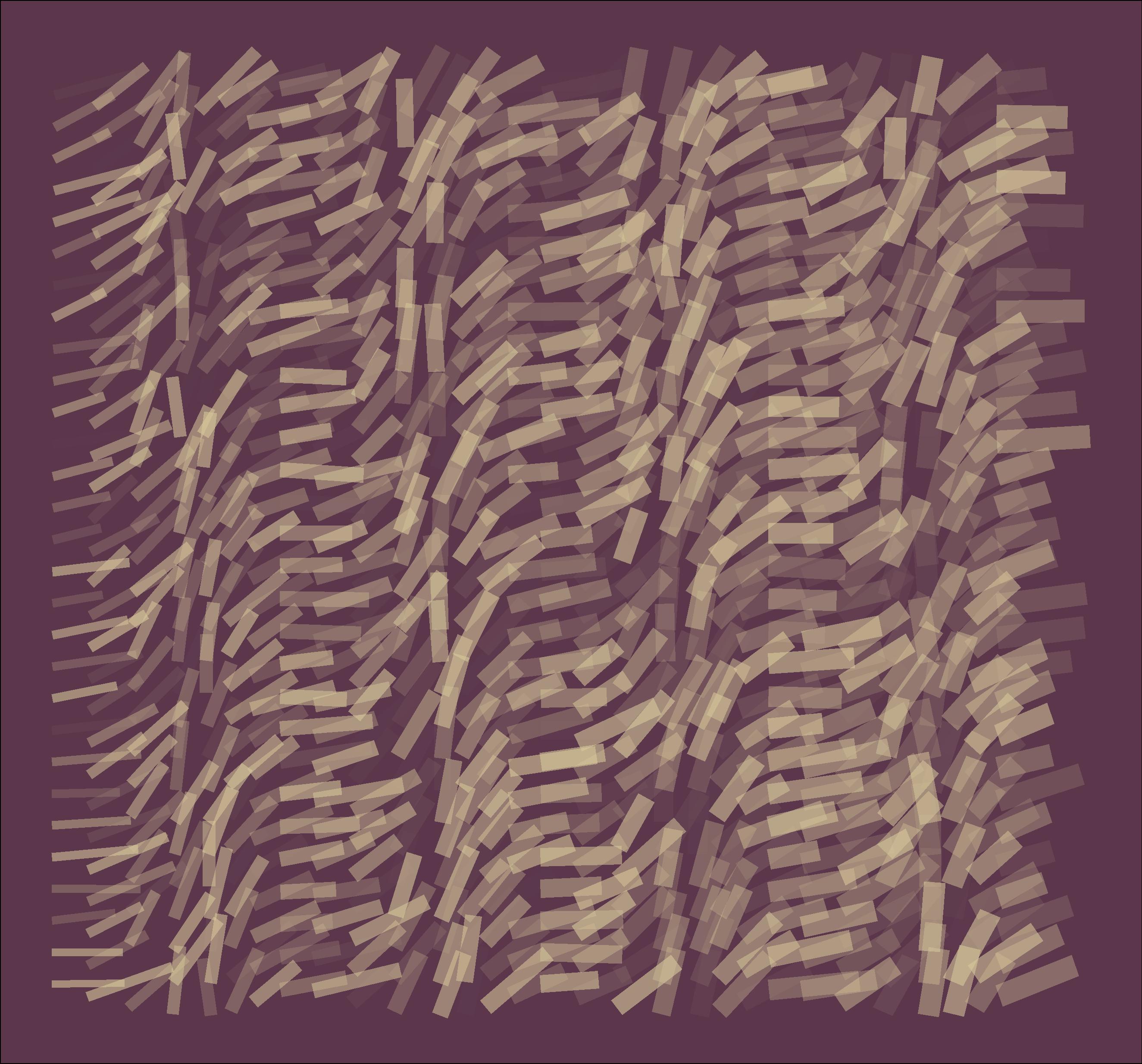
I ended up with this:

The main ideas:
- Start by plotting a rectangle with dots
- Connect the dots with a line
- Rotate the lines, from their respective centers.
I’m gonna write a little more about how I tackled this, but here the code: (sorry idk how to fold codes on blogdown yet 😭)
library(tidyverse)

plot_rotated_segments <- function(ncols, nrows, fin=ncols*nrows, frequency=0.25) {

  df <- crossing(x = 1:ncols, y = 1:nrows) %>%
    mutate(id = 1:fin)

  df <- df %>%
    left_join(df %>% mutate(id = id-1), by = "id") %>%
    rename(x = x.x, y = y.x, xend = x.y, yend = y.y) %>%
    filter(!is.na(xend)) %>%
    filter(x == xend)

  df <- df %>%
    mutate(xmid     = (x+xend) / 2,
           ymid     = (y+yend) / 2,
           angle    = (id/fin) * pi / frequency) %>%

    mutate(newxend  = xmid + abs(cos(angle)),
           newyend  = ymid + abs(sin(angle)),
           newx     = xmid - abs(cos(angle)),
           newy     = ymid - abs(sin(angle))) %>%

    mutate(newxend  = map_dbl(newxend, ~ .x+runif(1, min=-0.5,  max=0.9 )),
           newyend  = map_dbl(newyend, ~ .x+runif(1, min=-0.25, max=0.25))) %>%

    mutate(newalpha = map_dbl(id, ~runif(1, min = 0, max = 1)))

   ggplot(df) +
    # geom_point(aes(x = x, y = y)) +
    # geom_point(aes(x = xend, y = yend)) +
    # geom_segment(aes(x = x, y = y, xend = xend, yend = yend)) +
    geom_segment(aes(x = newx, y = newy, xend = newxend, yend = newyend, size = id, alpha = newalpha),
                 color = "#D8C99B",
                 show.legend = FALSE) +
    scale_size_continuous(range = c(2, 6)) +
    scale_alpha_continuous(range = c(0, 0.6)) +
    theme_void() +
    theme(
      plot.background = element_rect(fill = "#5C374C")
    )
}

# plot_rotated_segments(ncols = 25, nrows = 25, frequency = 0.021575)
Let’s go rstats
I’ll just start from scratch without using the function. But it’s super fun to mess around with the parameters, so I highly encourage it!
Here’s a 10 x 10 canvas. coord_eqaul wouldn’t be a bad idea, but i don’t know aspect ratio, and it worked without using it this time lol
dat <- crossing(x = 1:10, y = 1:10) %>%
    mutate(id = 1:100)

dat %>% head()
## # A tibble: 6 x 3
## x y id
## <int> <int> <int>
## 1 1 1 1
## 2 1 2 2
## 3 1 3 3
## 4 1 4 4
## 5 1 5 5
## 6 1 6 6dat %>% ggplot(aes(x, y)) + geom_point()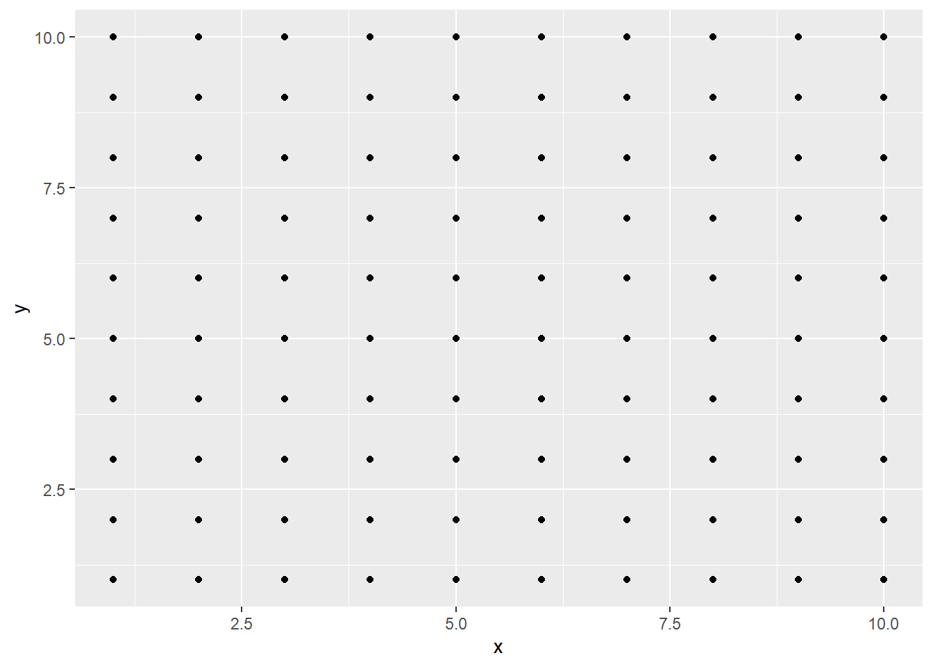
geom_segment lets you define 2 points to create a line that connects them. (x, y, xend, yend) So we need to point the first dot to the second, second to the third, and so on. The “pointing” is done by adding them as 2 separate columns to the existing x/y. I’m sure there’s other good ways, but I’ve created another copy of the data, offsetted the id, and joined them together. Since the very last point that gets plotted, (10, 10) doesn’t have to point to anything, we can get rid of that row.
dat <- dat %>%
  left_join(dat %>% mutate(id = id-1), by = "id") %>% # left_join gang
  rename(x = x.x, y = y.x, xend = x.y, yend = y.y) %>%
  filter(!is.na(xend))

dat %>%
  ggplot(aes(x, y)) +
  geom_point() +
  geom_segment(aes(x = x, y = y, xend = xend, yend = yend))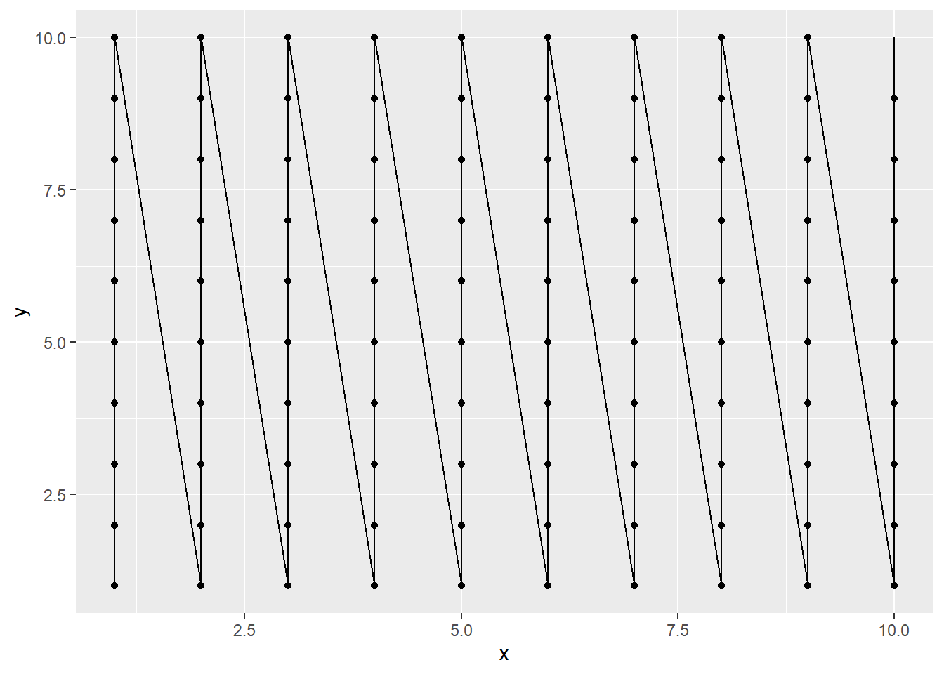
Let’s get rid of the diagonal lines. This felt really manual, but I filtered out any rows whose x is not xend
dat <- dat %>%
  filter(x == xend)

# Same code as above, not formatting cuz space
dat %>% ggplot(aes(x, y)) + geom_point() + geom_segment(aes(x = x, y = y, xend = xend, yend = yend))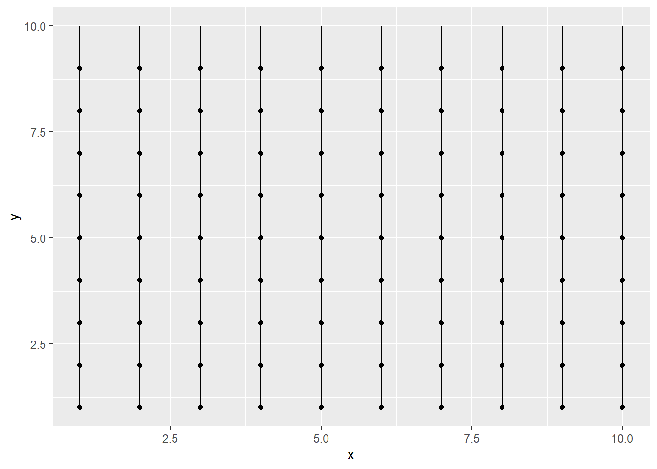
Now we need to rotate the lines to create some patterns. We do this by holding our segments in the middle, then spinning it.
I didn’t have the coding skills at this time to draw 100 small circles to our plot, but the idea in essence, is this gif, where the middle of the pencil is our midpoints in the y scale:

Here are the midpoints…
dat <- dat %>%
    mutate(xmid = (x+xend) / 2,
           ymid = (y+yend) / 2)
dat %>%
  ggplot() +
  geom_point(aes(x, y)) +
  geom_point(aes(xmid, ymid, color = "red", size = 3), show.legend = FALSE) +
  geom_segment(aes(x = x, y = y, xend = xend, yend = yend))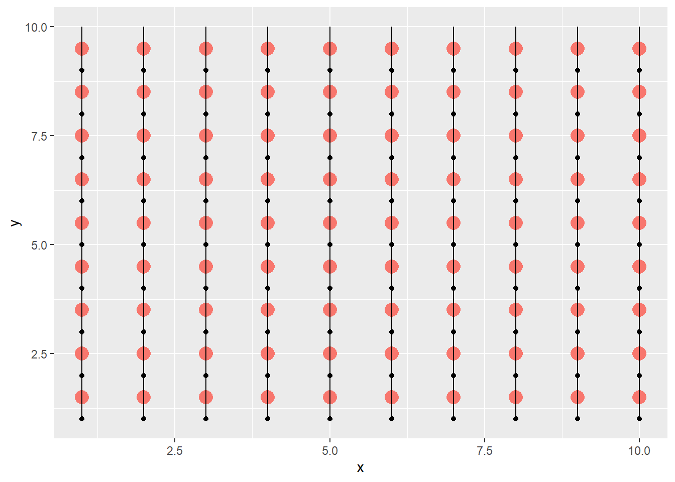
Now to rotate, we redefine the x, y, xend, yend coordinates. We do this by dividing up a certain angle (I’ll do 2 * pi, a full circle), and use cos/sin at the specific angle to get the x/y coordinates which gets added/subtracted to the midpoint. (I know the 100 isn’t accurate, because we took some points away, and I really should fix the final output too, but I’m already too deep into this post lol)
dat <- dat %>%
  mutate(angle   = id/100 * 2*pi,
         newxend = xmid + cos(angle),
         newyend = ymid + sin(angle),
         newx    = xmid - cos(angle),
         newy    = ymid - sin(angle))

dat %>%
  ggplot() +
  geom_point(aes(x, y)) +
  geom_point(aes(xmid, ymid, color = "red", size = 3), show.legend = FALSE) +
  geom_segment(aes(x = x, y = y, xend = xend, yend = yend)) +
  geom_segment(aes(x = newx, y = newy, xend = newxend, yend = newyend), color = "red")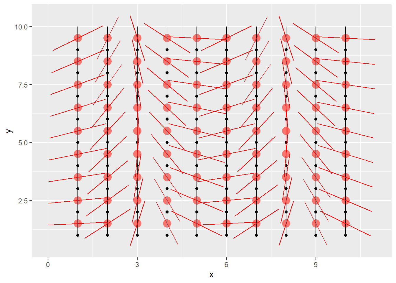
That’s really it. I applied some randomness using the runif function to the coordinates, and added some aesthetics. I’m having such a blast learning about this stuff. Next up, I might be interested in distributions.