
Analyzing Burritos Ratings with Bootstrap Resampling
You ever had to make a big decision out of a small dataset, and weren’t sure if you’re making the right call? Maybe you’re conducting a survey to see how COVID affected the spending habits of university students vs people in their 40s, and only 10 students responded. Or maybe you’re an analyst in a big company, who’s trying to make a pricing decision based on past performances, but you only have 3 weeks of data. What these two problems have in common is the lack of sample size and the uncertainty of the decisions that come from it. I, for one, asked myself many times, “K, I did all the analysis correctly, but does this really tell the whole story?”
In this short blog post, I’m going to explain & demonstrate a stat technique called bootstrap resampling that can help answer that question. Big thanks to brilliant Julia Silge’s video that gave me the inspiration.
If you already know what bootstrap is, or don’t feel like reading my interpretation, feel free to skip the next paragraph lol
In its essence, bootstrap works by taking many samples from a dataset with replacement and conducting whatever you want to find out over and over again. For example, let’s say I want to know what the favourite Netflix show is among 14 of my friends whose names are 2,3,4,...,9, 10,J,Q,K,A. Now, I take a deck of cards (52 / 4 = 13, everyone has an equal chance of being selected), and randomly pick one up. Let’s say 5 of hearts was drawn, and her favourite show is the Office. Ok, cool. Now, I put the 5 of heart back into the deck, shuffle, and draw another card. And this time, 3 of spades was drawn, and his favourite show is Modern Family. We put the card back in and draw another one. This time, by chance, we picked up the 5 of hearts again. So we have 2 Office and 1 Modern family. You get the idea. We repeat this until we’ve drawn 14, and it so happens that the Office was the majority out of 14. Now, we can say the result of this round of draws was the Office. If we run this a thousand times, and tally up the results. Maybe the Office won 800 rounds, 150 for Modern Family and the rest went to other shows. At this point, we can confidently say that out of these 14 people, their favourite show is the Office.
Ok, now that we’ve covered the fundamentals, let’s see how this works in action.
Burritos Ratings
I got this random data from Jeremy Singer-Vine’s Data is Plural newsletter. Apparently guy works for BuzzFeed, I had no idea until today.
library(tidyverse)
library(tidymodels)
burritos <- read_csv("burritos.csv") %>%
  filter(!is.na(overall)) %>%
  group_by(location, type) %>%
  summarize(score = mean(overall)) %>%
  ungroup()

burritos
## # A tibble: 269 x 3
## location type score
## <chr> <chr> <dbl>
## 1 Albertacos California 3.7
## 2 Albertacos Carne asada 3.2
## 3 Alberto's 623 N Escondido Blvd, Escondido, CA 92025 Carne Asada 4.8
## 4 Burrito Box Steak with guacamo~ 3.5
## 5 Burrito Factory Steak everything 3.5
## 6 Burros and Fries California 3.65
## 7 Burros and Fries Carne asada 4
## 8 Burros and Fries Shrimp california 3
## 9 Caliente Mexican Food California 2
## 10 Caliente Mexican Food carne asada 3.75
## # ... with 259 more rowsBasically, it’s consisted of Locations of the restaurant, the type of burritos, and their score. I do some minor cleaning by filtering out NA’s and squishing duplicates.
I am interested to see if certain types of burritos are more likely to score higher than others. Let’s see how many types there are.
burritos %>%
  count(type, sort = TRUE)
## # A tibble: 125 x 2
## type n
## <chr> <int>
## 1 California 63
## 2 Carne asada 20
## 3 Carnitas 12
## 4 Adobada 9
## 5 Surf & Turf 9
## 6 Al pastor 7
## 7 Breakfast 3
## 8 Carne Asada 3
## 9 Custom 3
## 10 Fish 3
## # ... with 115 more rowsThat’s almost too many types. Let’s filter out any types that have less than 7 ratings. And then I’m going to turn every type that is not California, into Others.
burritos_filtered <- burritos %>%
  group_by(type) %>%
  filter(n() >= 7) %>%
  ungroup() %>%
  mutate(type = ifelse(type == "California", type, "Others"))

burritos_filtered %>%
  count(type)
## # A tibble: 2 x 2
## type n
## * <chr> <int>
## 1 California 63
## 2 Others 57Ok, Now that the two categories we want to compare are relatively similar in size, let’s see if the California burrito scores better than others.
Exploratory Analysis
There’s a couple ways to do this. First, I’m just going to simply average out the scores and make a plot out of it.
burritos_filtered %>%
  group_by(type) %>%
  summarize(score = mean(score)) %>%
  ggplot(aes(type, score, fill = factor(score))) +
  geom_col()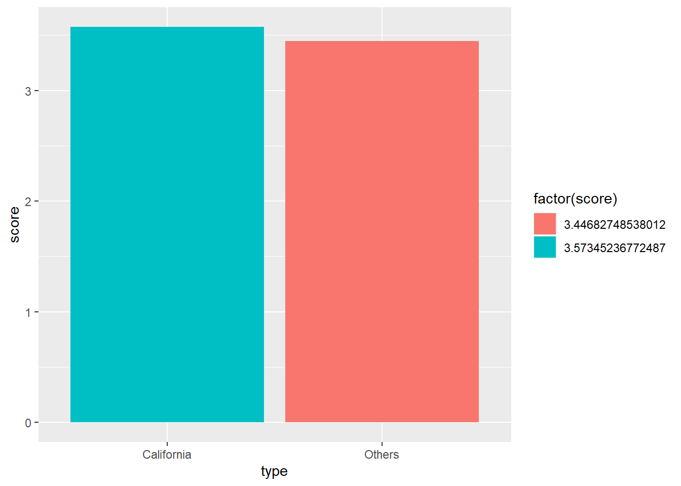
From the look of it, California is slightly scored better than others. But it’s tough to say conclusively, since it’s really close.
To make things a little more concrete, I’m going to run a simple linear regression model with 0 in the model, to skip the intercept. So basically if it’s not California, it’s Others. There’s no base value (y-int) that we start with and take away/add scores if it’s California. (hope this makes sense?)
burritos_fit <- lm(data = burritos_filtered, score ~ 0 + type)

tidy(burritos_fit)
## # A tibble: 2 x 5
## term estimate std.error statistic p.value
## <chr> <dbl> <dbl> <dbl> <dbl>
## 1 typeCalifornia 3.57 0.0813 44.0 5.17e-75
## 2 typeOthers 3.45 0.0855 40.3 7.14e-71Same results as the graph, it looks like California is better, but difficult to say it’s definitely better. This is a perfect opportunity to use bootstrap!
Bootstrap
K, so this tidymodels is a collection of modelling packages. I am not familiar with this framework, so I’m excited to give this a shot! So it’s as simple as calling the bootstraps function, feeding it the data, how many times you want to re-sample, and the apparent argument is TRUE, when your sample is the whole population. It returns a dataframe with splits column, containing training/testing splits of data (which I don’t think we’ll need for bootstrapping), and id column.
library(tidymodels)
set.seed(1)

burritos_boot <- bootstraps(burritos_filtered,
                            times = 1000,
                            apparent = TRUE)

burritos_boot
## # Bootstrap sampling with apparent sample
## # A tibble: 1,001 x 2
## splits id
## <list> <chr>
## 1 <split [120/48]> Bootstrap0001
## 2 <split [120/41]> Bootstrap0002
## 3 <split [120/47]> Bootstrap0003
## 4 <split [120/42]> Bootstrap0004
## 5 <split [120/42]> Bootstrap0005
## 6 <split [120/50]> Bootstrap0006
## 7 <split [120/43]> Bootstrap0007
## 8 <split [120/44]> Bootstrap0008
## 9 <split [120/53]> Bootstrap0009
## 10 <split [120/42]> Bootstrap0010
## # ... with 991 more rowsOn top of this dataframe, we’re going to map a linear regression we did above. It’ll make more sense with the output, but essentially, we’re adding as a column the model spec, as well as the result of the linear model like the one you saw before, using each split.
burritos_models <- burritos_boot %>%
  mutate(model = map(splits, ~ lm(data = ., score ~ 0 + type)),
         coef_info = map(model, tidy))

burritos_models
## # Bootstrap sampling with apparent sample
## # A tibble: 1,001 x 4
## splits id model coef_info
## <list> <chr> <list> <list>
## 1 <split [120/48]> Bootstrap0001 <lm> <tibble [2 x 5]>
## 2 <split [120/41]> Bootstrap0002 <lm> <tibble [2 x 5]>
## 3 <split [120/47]> Bootstrap0003 <lm> <tibble [2 x 5]>
## 4 <split [120/42]> Bootstrap0004 <lm> <tibble [2 x 5]>
## 5 <split [120/42]> Bootstrap0005 <lm> <tibble [2 x 5]>
## 6 <split [120/50]> Bootstrap0006 <lm> <tibble [2 x 5]>
## 7 <split [120/43]> Bootstrap0007 <lm> <tibble [2 x 5]>
## 8 <split [120/44]> Bootstrap0008 <lm> <tibble [2 x 5]>
## 9 <split [120/53]> Bootstrap0009 <lm> <tibble [2 x 5]>
## 10 <split [120/42]> Bootstrap0010 <lm> <tibble [2 x 5]>
## # ... with 991 more rowsThe model column is the actual model, and coef_info is the results, hopefully it’s not too confusing
And a quick unnest the coef_info
burritos_coefs <- burritos_models %>%
  unnest(coef_info)

burritos_coefs
## # A tibble: 2,002 x 8
## splits id model term estimate std.error statistic p.value
## <list> <chr> <lis> <chr> <dbl> <dbl> <dbl> <dbl>
## 1 <split [120~ Bootstrap~ <lm> typeCali~ 3.57 0.0710 50.2 1.67e-81
## 2 <split [120~ Bootstrap~ <lm> typeOthe~ 3.57 0.0826 43.2 3.39e-74
## 3 <split [120~ Bootstrap~ <lm> typeCali~ 3.58 0.0714 50.1 2.34e-81
## 4 <split [120~ Bootstrap~ <lm> typeOthe~ 3.49 0.0890 39.2 1.58e-69
## 5 <split [120~ Bootstrap~ <lm> typeCali~ 3.47 0.0886 39.2 1.82e-69
## 6 <split [120~ Bootstrap~ <lm> typeOthe~ 3.29 0.0857 38.4 1.47e-68
## 7 <split [120~ Bootstrap~ <lm> typeCali~ 3.59 0.0694 51.8 5.21e-83
## 8 <split [120~ Bootstrap~ <lm> typeOthe~ 3.38 0.0912 37.1 6.81e-67
## 9 <split [120~ Bootstrap~ <lm> typeCali~ 3.56 0.0780 45.6 8.36e-77
## 10 <split [120~ Bootstrap~ <lm> typeOthe~ 3.43 0.0780 43.9 5.82e-75
## # ... with 1,992 more rowsGreat! Now we have linear regression results for every split! Now let’s make a histogram out of this.
burritos_coefs %>%
  ggplot(aes(estimate, fill = term)) +
  geom_histogram(alpha = 0.5) +
  labs(title = "California Burritos are better rated than all other types!",
       x = "Score",
       y = "Count")
## `stat_bin()` using `bins = 30`. Pick better value with `binwidth`.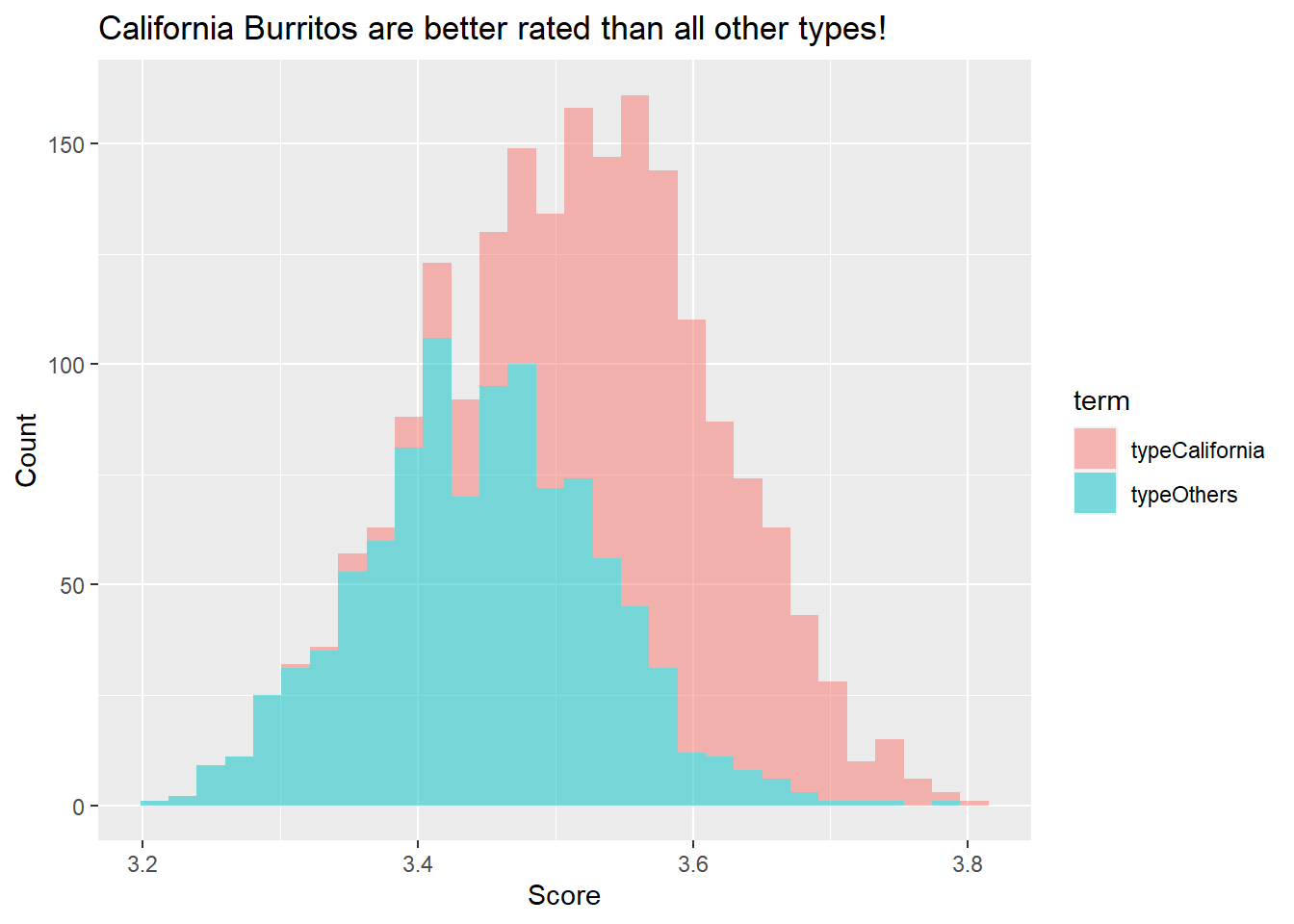
This histogram shows where all the results from 1000 resamples landed. Judging from it, California clearly outperforming Others!
Conclusion
There you have it folks. We looked at how we can use bootstrapping in less than 130 lines of codes! (including texts!) This was really fun for me, I can see myself using this a lot with work and pretty much anytime I need to validate something. Hopefully you found it helpful as well.